Crafting a cohesive visual language, I contributed to documenting an in-depth pre-renovation study conducted by 210-6 Architects.
Client
210-6 Architects
Contribution
Graphic design, Data visualization
Background
The pre-renovation study of a building at 13 Somayyeh Street delves into its history, analyzes its current state and recommends potential scenarios based on cultural, social, and economic factors. A unified visual language was essential for effectively presenting study deliverables.
Design
The primary objective was to enhance reader engagement using visual design. I took a simple approach and allocated only 50 percent -or less- of the page to the text to prevent information overload; I left ample area for graphic and white space. I took every chance to use visualizations to balance between text and figures.
The basic page layout patterns
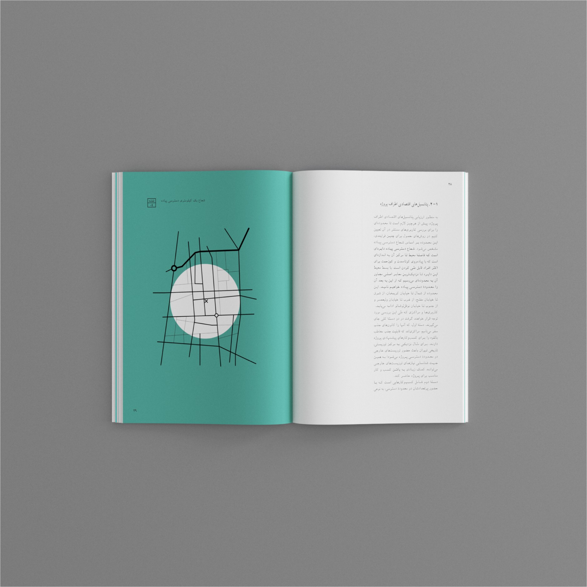
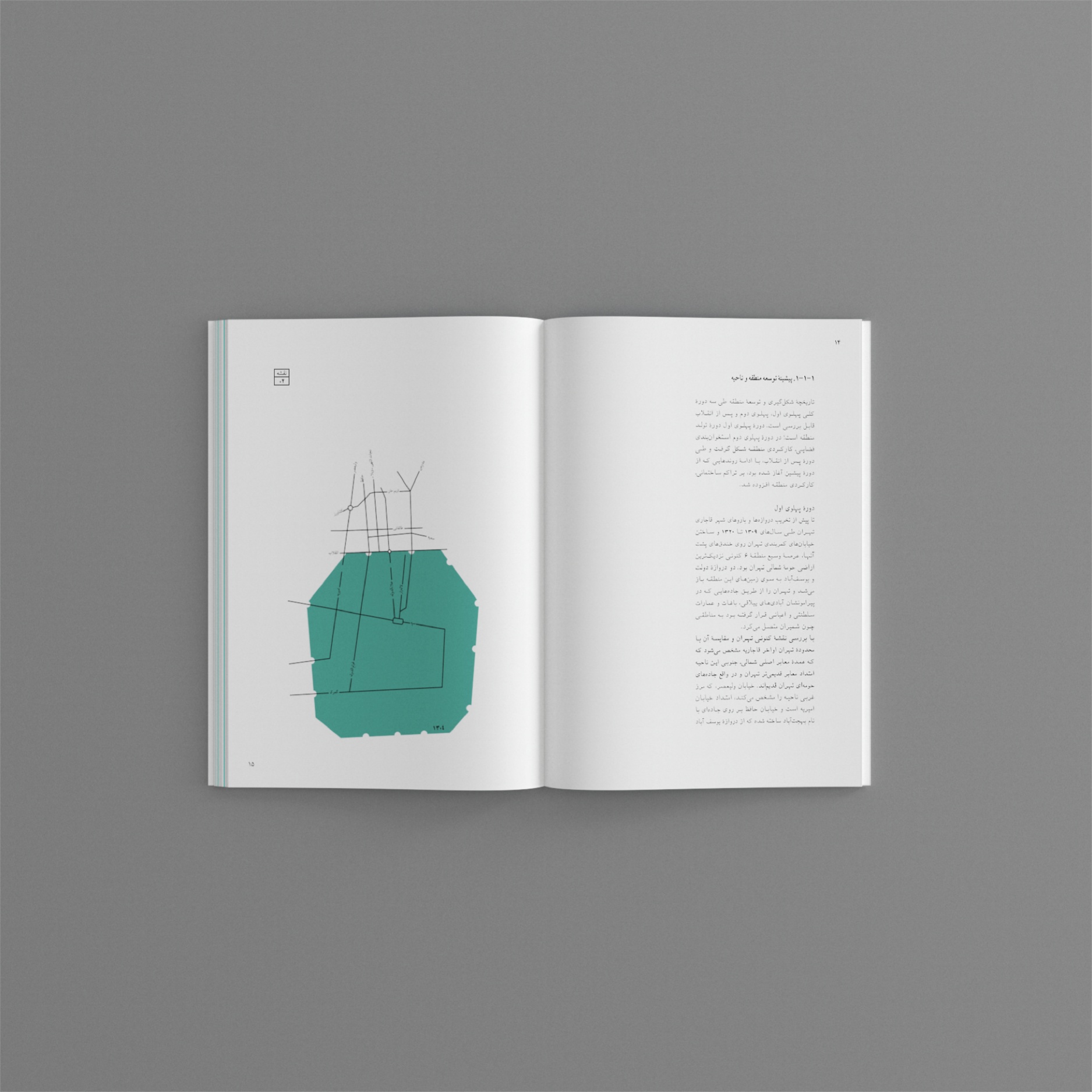
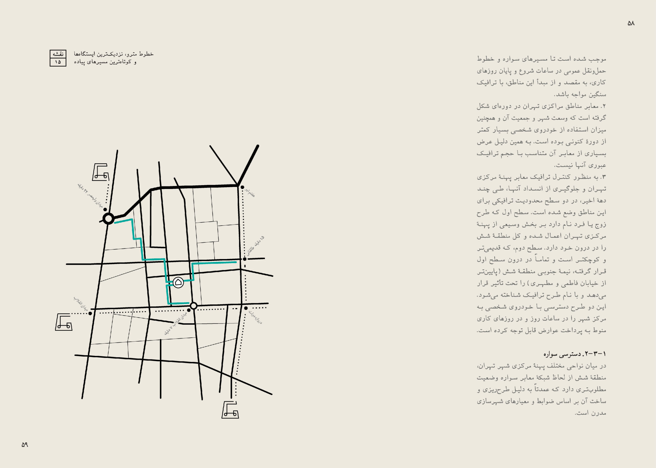
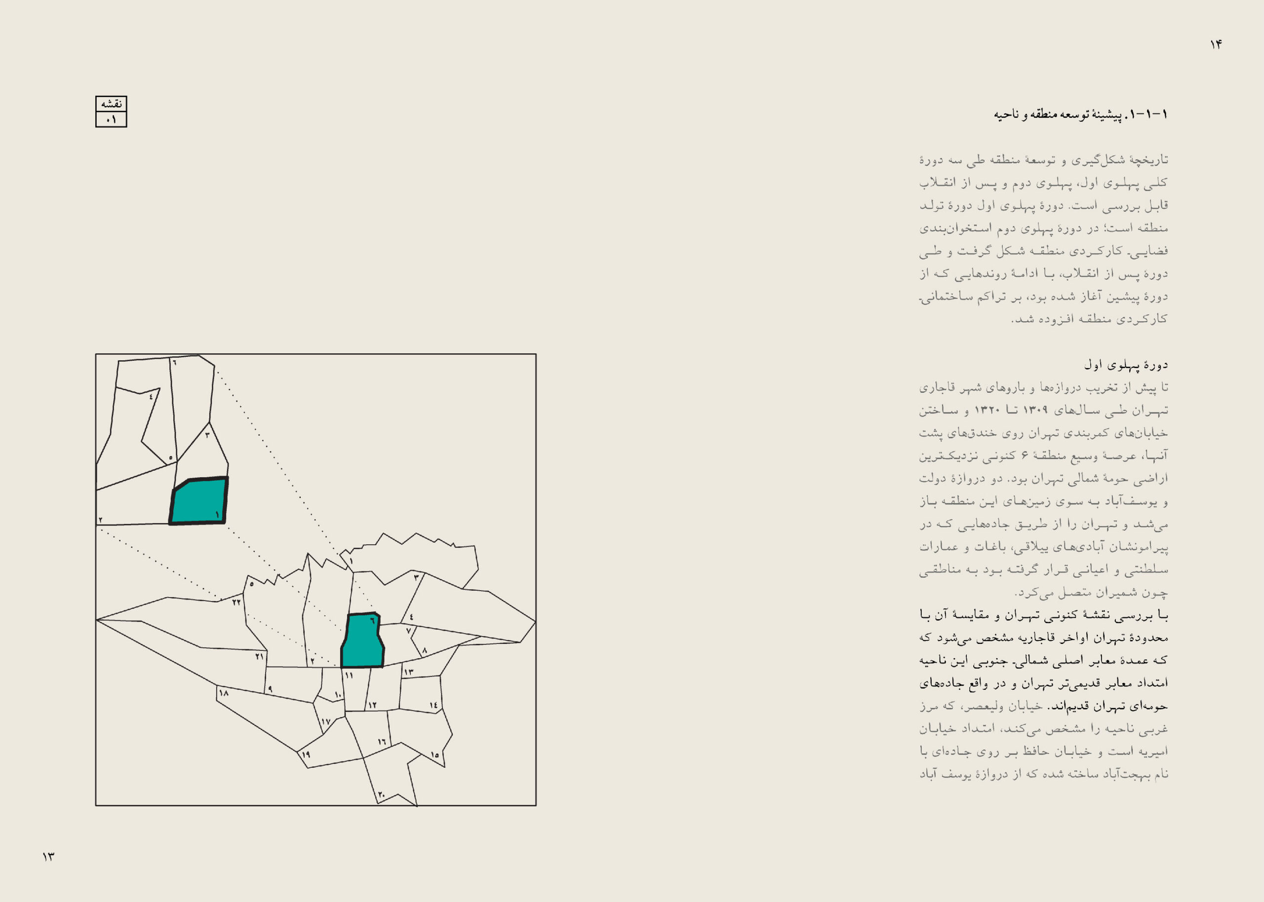
Maps
I simplified standard maps by removing unnecessary information and turned each map into a distinctive ilustration to make the reviewing process less monotonous for readers.

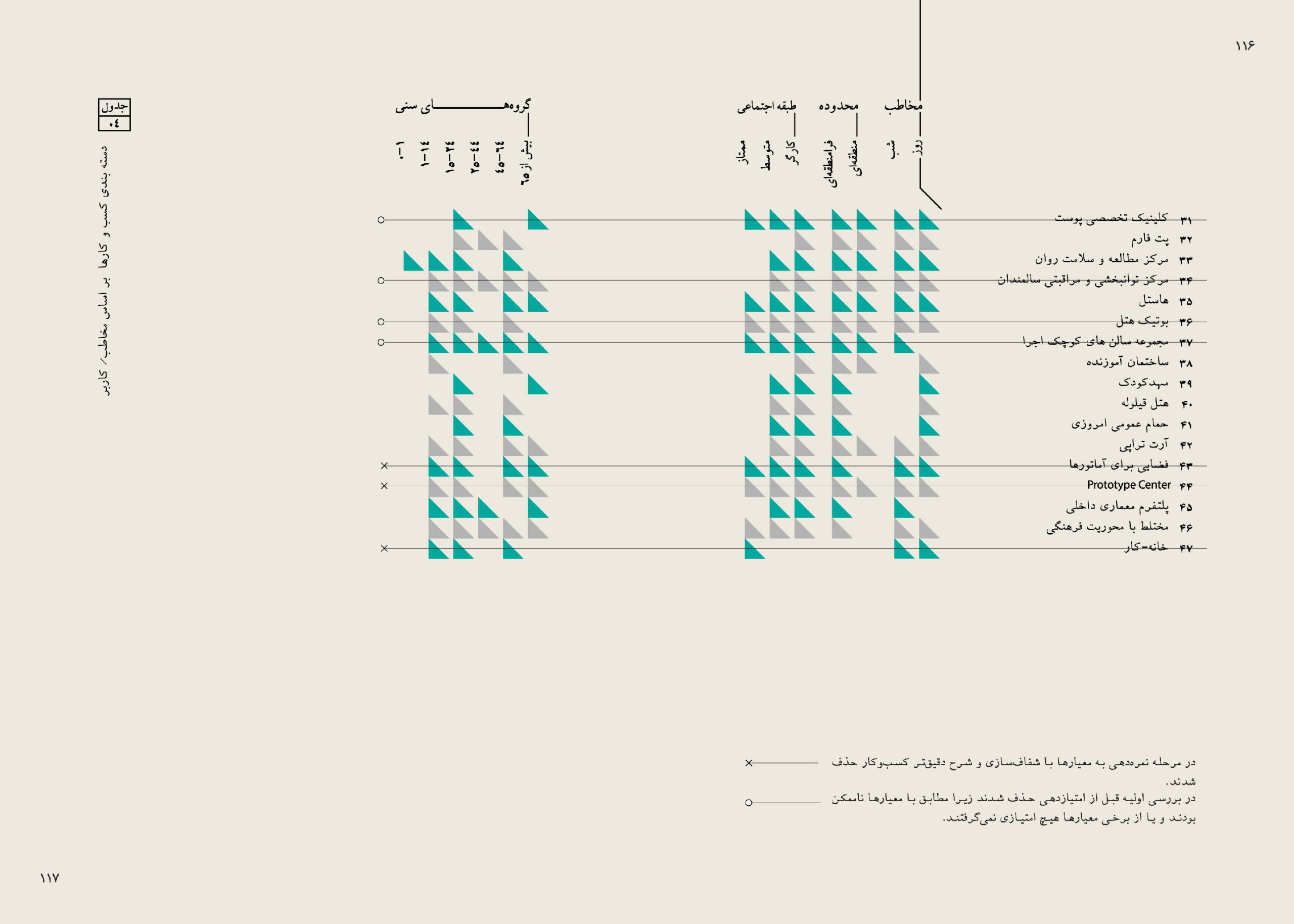
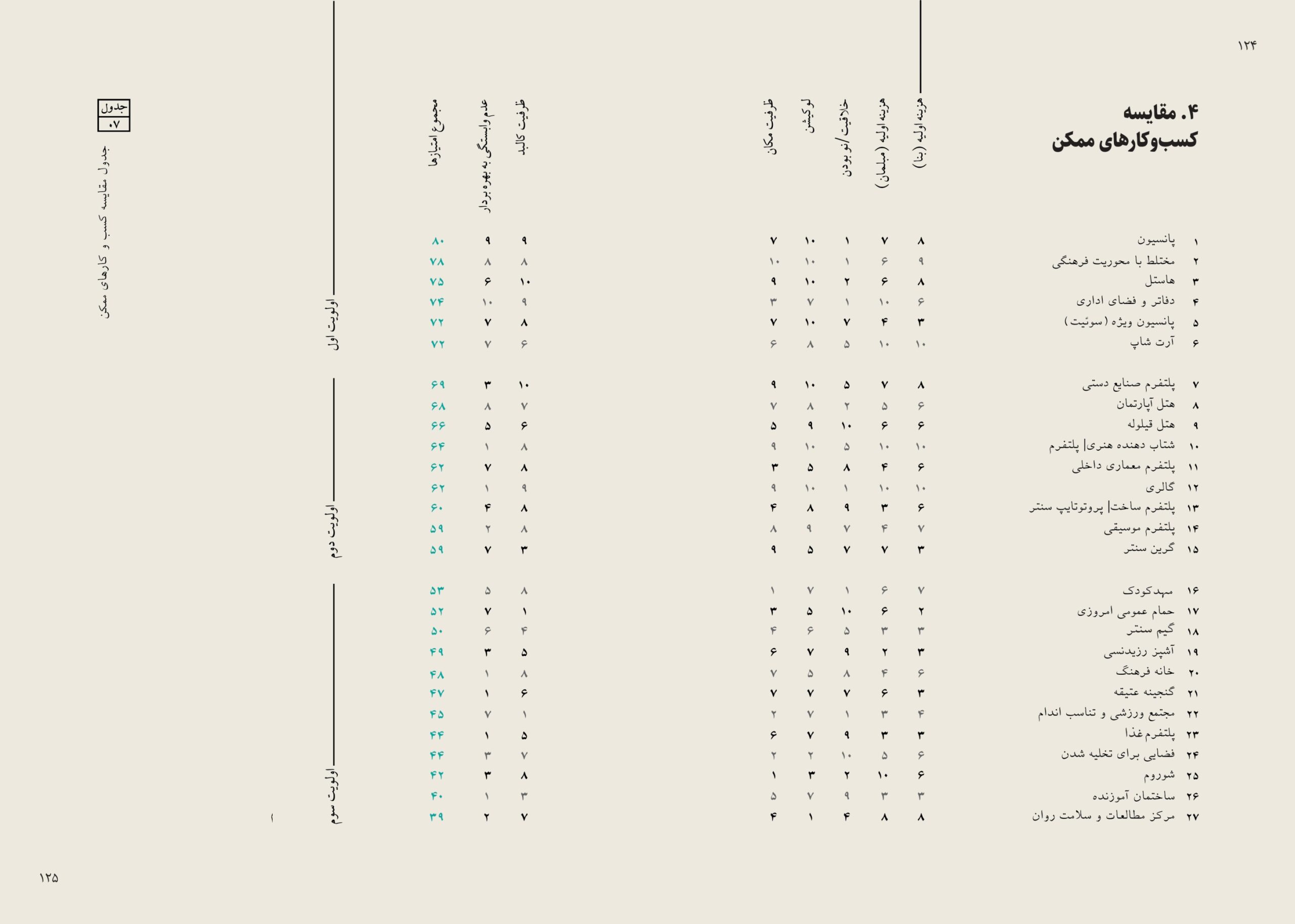
Tables
Tables comprised more than 20 percent of the book content. I paid close attention to the design and crafted an unconventional type of table with no cell borders, implementing free lines, shapes, and vertical labels to better engagement.
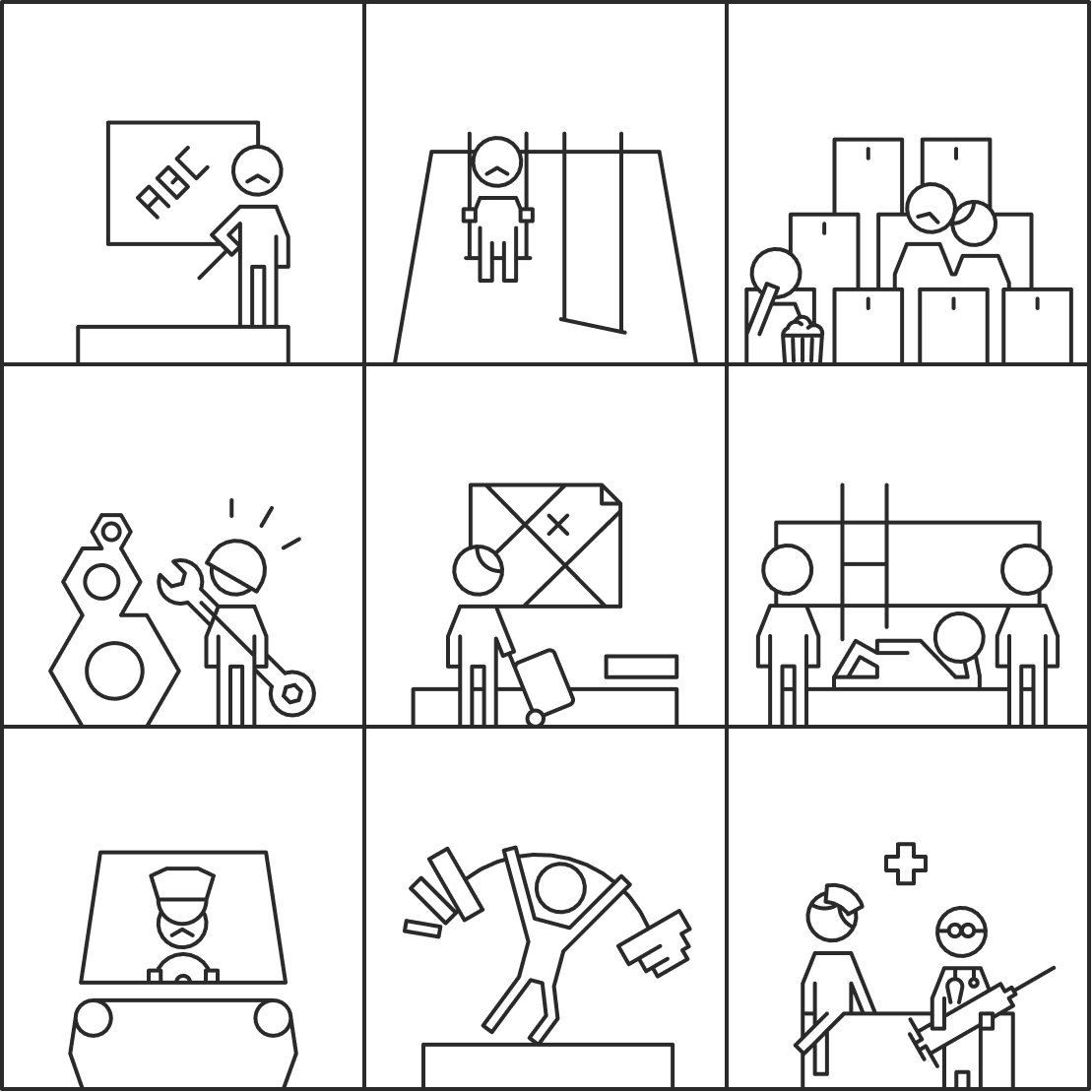
Pictographs
I crafted dozens of pictographs, each representing a specific use case of the building. These pictographs are used in various sections where the intended use case was mentioned.
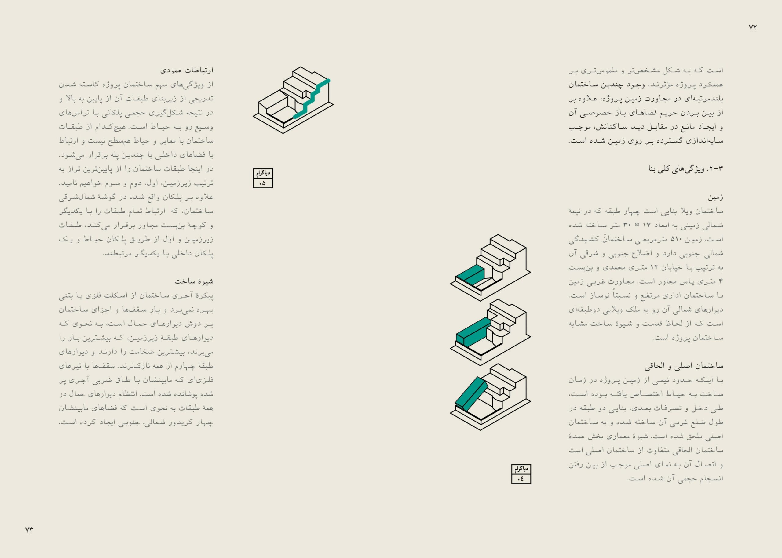
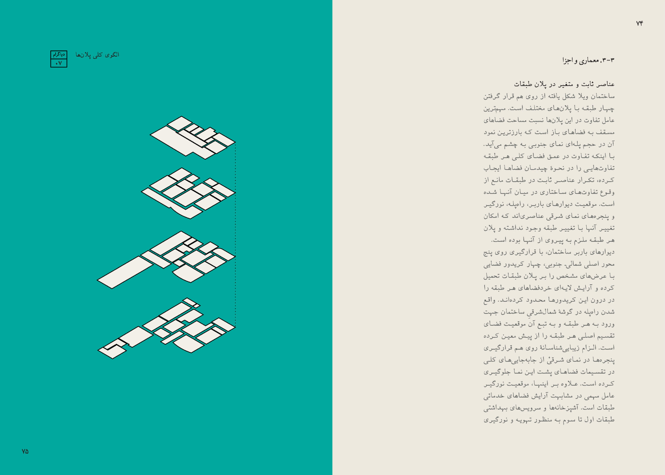
Diagrams
I drew various diagrams throughout the book to convey concepts through visualization. Each one compromises a simple figure of the building and one of its functionality in different contexts. All the drawings have an isometric style for simplicity and consistency.
Other details
For the numbering of the visual elements, I created labels reflecting the theme of the era in which the building was designed. These labels sort figures into four categories: image, map, table, and diagram.

Aesthetically, the same approach applied to the 'age group' badges. These badges were used in the suggested scenarios section and indicated the potential target users for certain usabilities.

Finally, inspired by decorative metalworks in the early 60s buildings in Tehran, I turned the project's title into an illustration for the book's cover using simple geometric shapes.