I helped OptoMedia's clients improve the usability of their websites by designing effective landing pages prioritizing an intuitive user experience aligned with each brand's visual identity.
Client
Optomedia
Team
George Papazian — Project Manager, Developer
Contribution
User experience
Background
Optomedia specializes in reliable and affordable web development services for small to medium businesses. After completing my UX studies, I had the opportunity to contribute to some of their projects by designing web pages that embodied clients' needs and fostered user-friendly experiences.
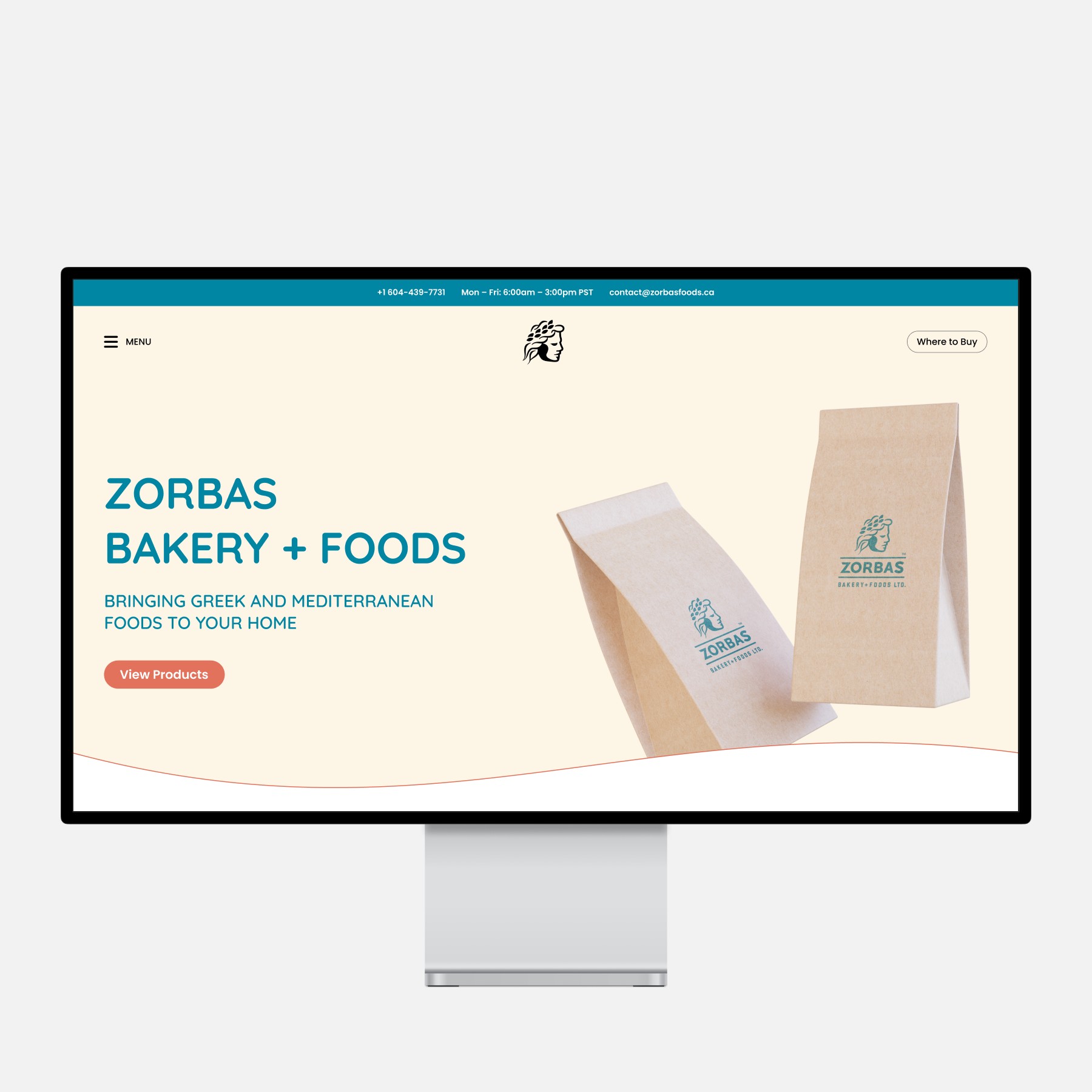
The Zorbas new home page has a refreshed look and accommodates more information from the sub-pages in an easy-to-follow sequence.
Approach
Considering the projects' limited timeframe and budget, I generally followed five main steps for each project:
1
Audited the current design to identify areas for improvement and extract established branding, given the absence of a design system or guidelines.
2
Gathered client insights by sharing the audit findings and discussing their goals and needs.
3
Reorganized content to ensure users can easily find what they need and have a seamless experience.
4
Applied branding, either maintaining the current one or introducing a revamped version.
3
Reorganized content to ensure users can easily find what they need and have a seamless experience.
4
Applied branding, either maintaining the current one or introducing a revamped version.
5
Delivered a high-fidelity mockup in Figma containing all the information for an easy transition from design to implementation.
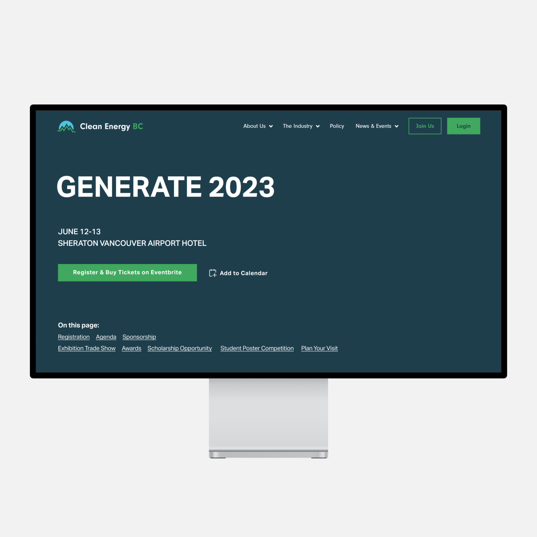
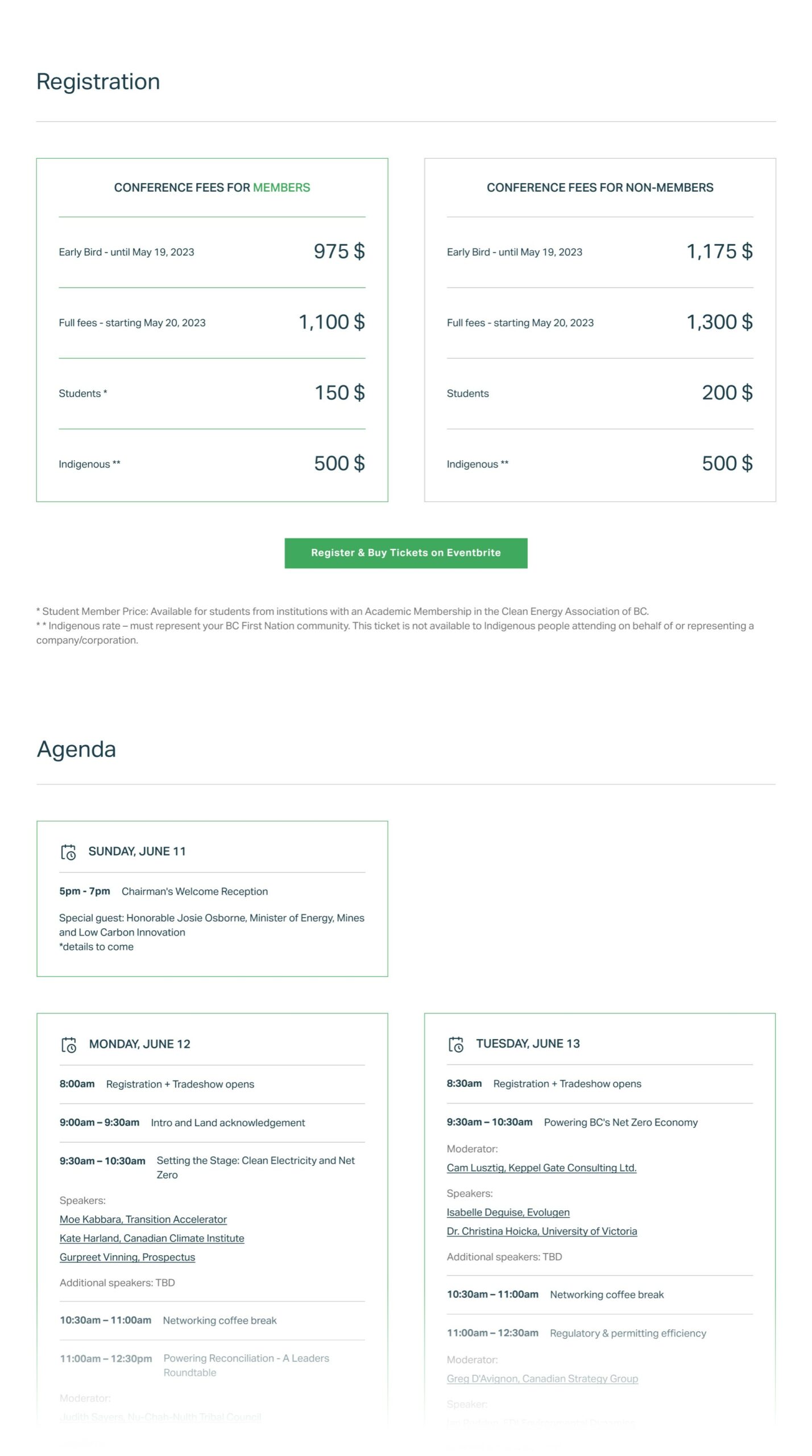
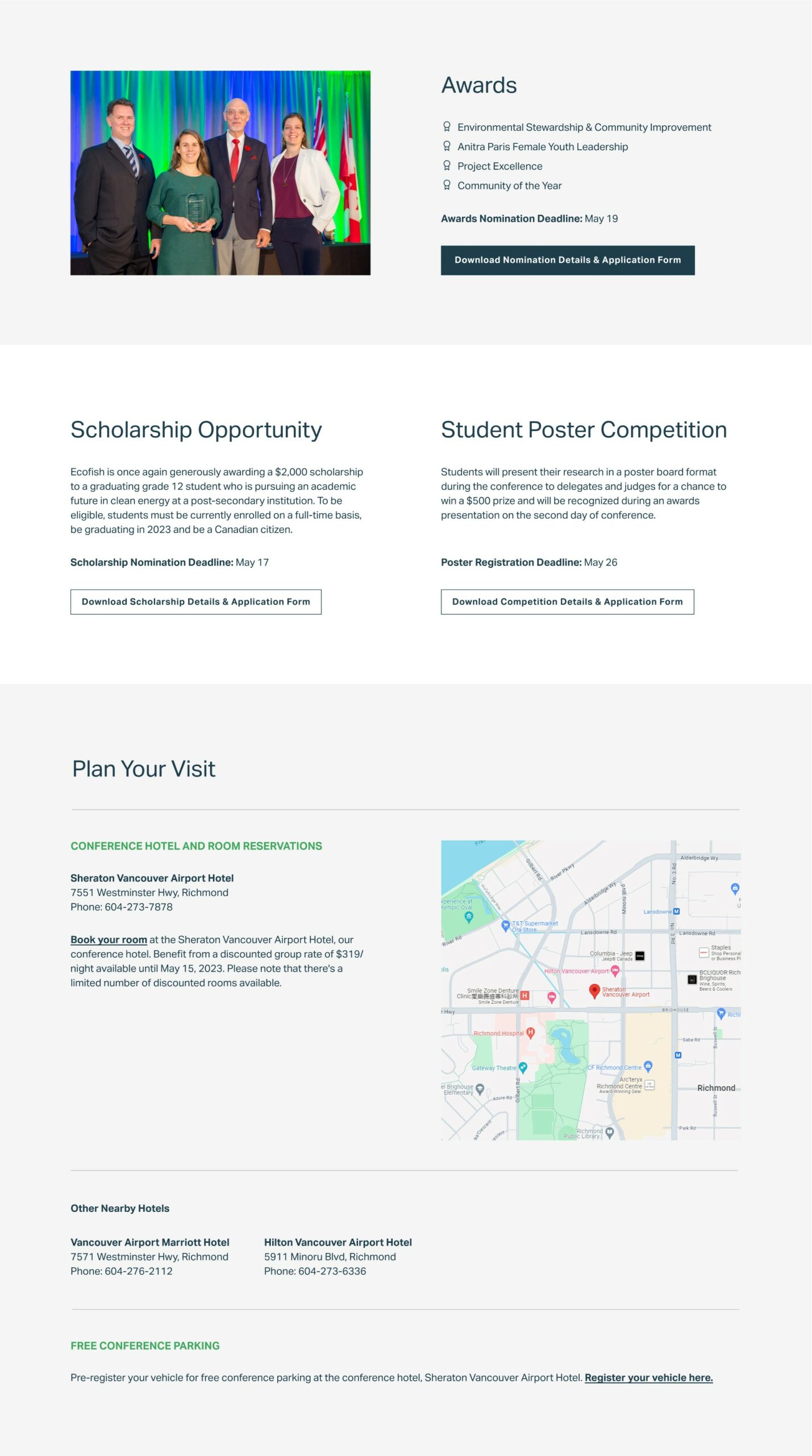
The Generate Conference web page provides visitors with necessary information from registration to planning the visit with a clear visual hierarchy.
Using anchor links and descriptive call-to-action buttons alongside the meticulously designed visual cues throughout the page helped reduce information overload.
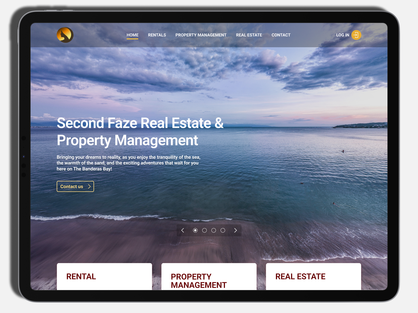
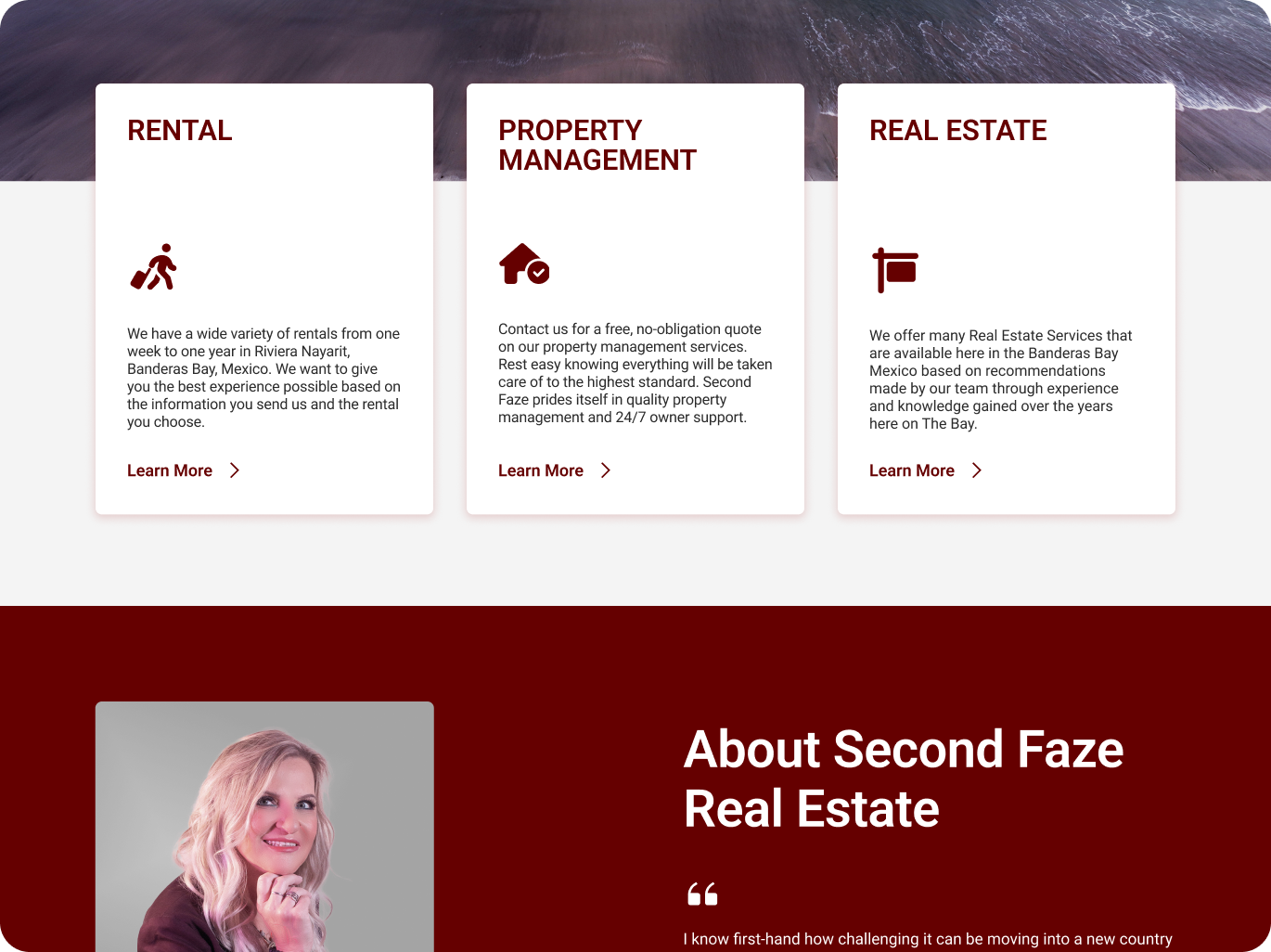
In the new home page for Second Faze, the content is spread out to help visitors easily find the information they need, while the design stays true to the original branding.
The prominent cards introducing the business' services are overlapped with the cover image to give users a visual cue and encourage them to scroll for additional information.