A user-driven platform designed to rank news articles, promote collective awareness, and empower people to take action on critical issues.
Type
School project
Duaration
12 weeks
Contribution
Solo project, I was responsible for the end to end design cycle
Problem
Difficulty in finding reliable news, marginalization of certain narratives, and lack of media accountability
The spread of false information hinders progress toward meaningful changes and can lead to harmful consequences. While professional journalism is critical for public awareness, the quality of reporting can vary, and some well-reported stories may be lost in the sheer volume of news. In this context, the primary problems One aimed to address are difficulty in finding reliable news, marginalization of certain narratives, and lack of media accountability.
Approach
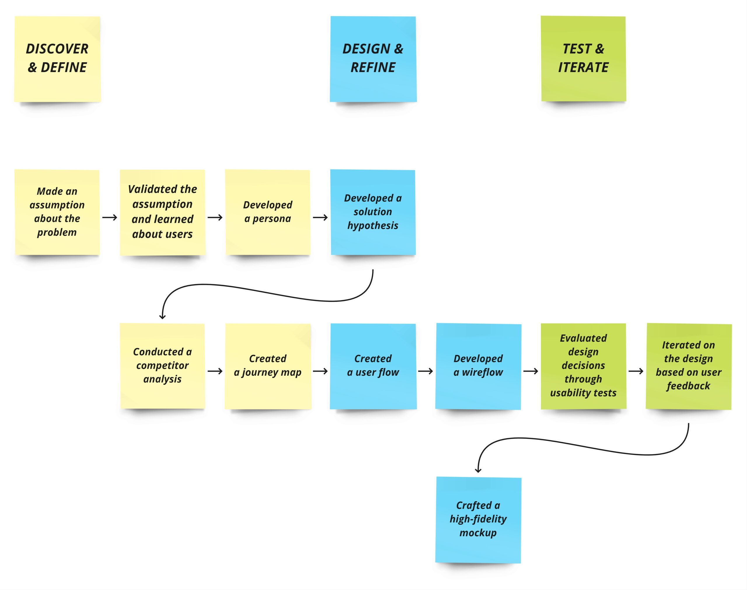
In the process of creating this project, I followed a structured approach to problem-solving. My process comprised three main phases shown in the following diagram:
Outcome
High-fidelity prototype
Discovering User's perspective
I conducted user interviews to validate my assumptions and learn about users' perspectives on news consumption, challenges, and preferences. My participants were five people aged 24 to 45 who actively consumed news from various sources.
Key findings
- Need for a more personalized news consumption experience
- Need for more control over content consumption in content-heavy platforms
- Difficulty in finding reliable news
- Frustration with online information overload
Avatars image by freepik
"I need a reliable and manageable source of information to stay informed about current events. Still, an overwhelming amount of data is out there, and it's hard to find what's credible."
Interviewee number 2
User Archetype — The Advocate
Informed by the findings from interviews, I defined a user archetype. Sarah the Advocate represents my target user.
Goals
- To stay informed about global, national, or local events
- To actively participate in social and political matters
- To connect with like-minded people individuals and contribute to positive changes
Challenges
- Finding trustworthy news sources
- Navigating news outlets and social media platforms
- Managing an overwhelming volume of online content
Avatar image by freepik
Reframing the Insights
How might we design a platform that fosters collective awareness and highlights underrepresented stories while giving users control over the content, reducing information overload, and prioritizing ease of use?
Learning from Reddit
I conducted a competitor analysis to explore existing solutions and to identify opportunities for differentiation, I analyzed Reddit as a prominent community-driven platform. Here are the key takeaways for my design:
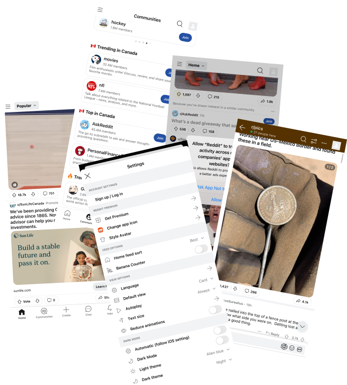
The good
The voting system helps determine content relevance.
App interaction without signing up can build trust.
The bad
A steep learning curve might lead to a higher drop-off rate.
A cluttered interface leads to distraction.
The ugly
Lack of moderation and user-generated content might lead to spam and spreading false information.
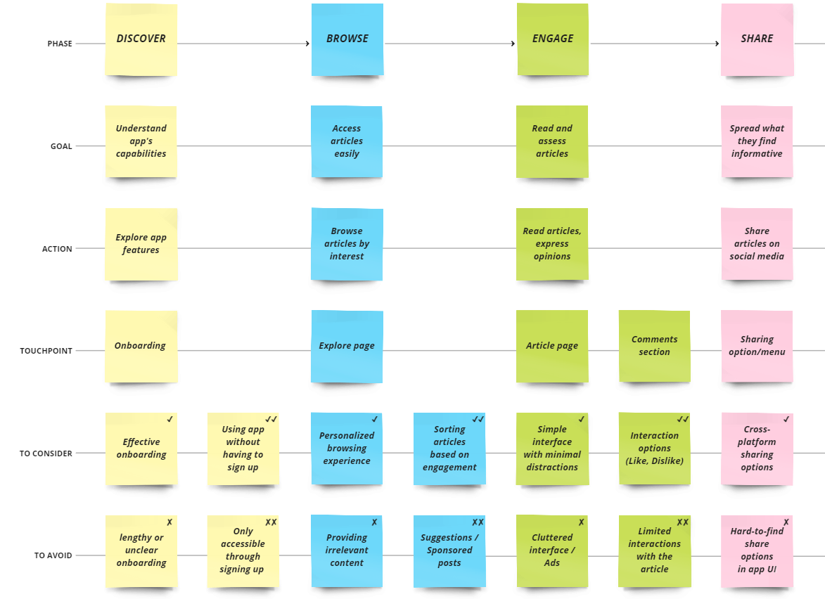
Mapping Key Touchpoints
Before building user flows, I mapped out the user journey. This allowed me to visualize the user's interactions with the platform, identify critical touchpoints, and address potential pain points.
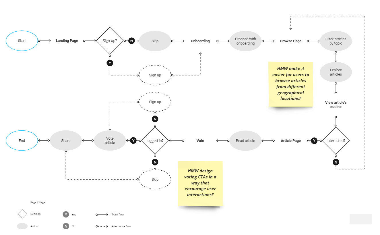
User Flow
As the next step, I picked the main user task and crafted a flow. This helped me to identify more friction points in detail and bring out opportunities for improvement.
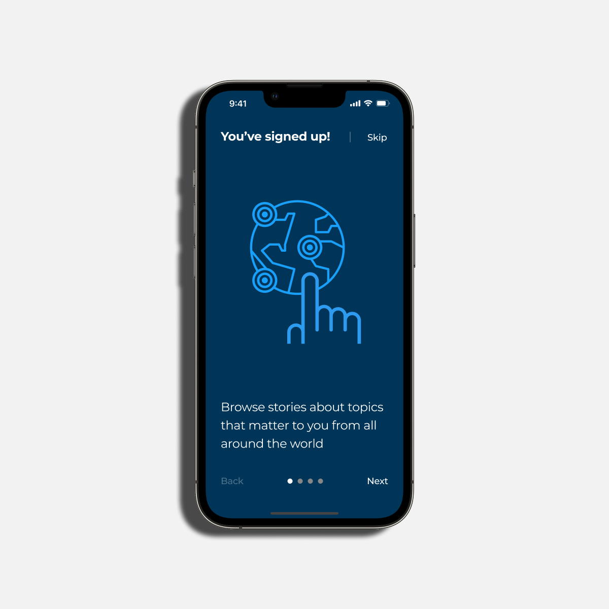
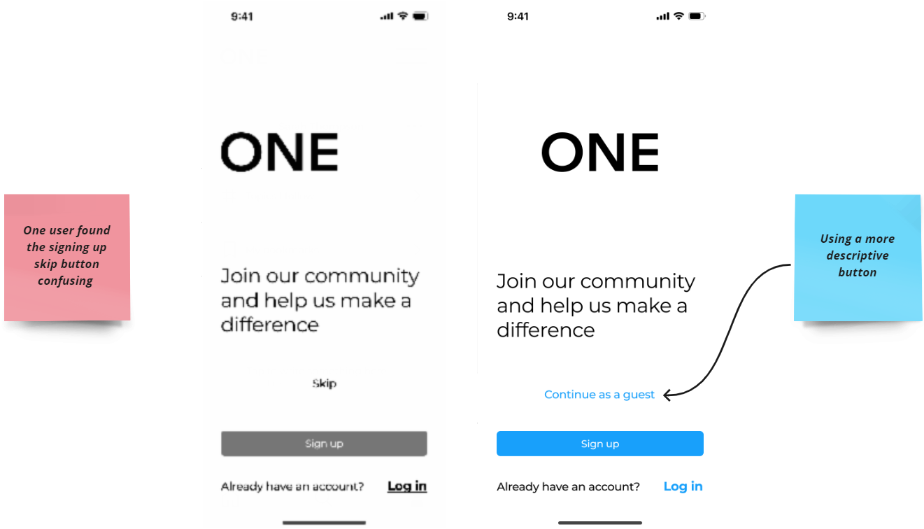
Optional sign-Up
The sign-up process is optional. Users can skip signing up and still access some features. To vote or share, they will be asked to sign up.
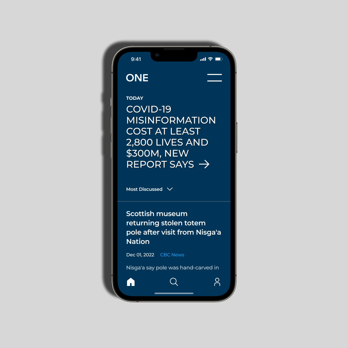
Browse page
The browse page is the key touchpoint in the user's journey. Users can quickly review featured articles and read their outlines on this page.
Flexible onboarding
The onboarding experience is available for both users who signed up and guests. Users can also opt out of the onboarding.
Filter by topic
I included a filter-by-topic feature in the user flow to allow users to filter articles based on their preferred topics.
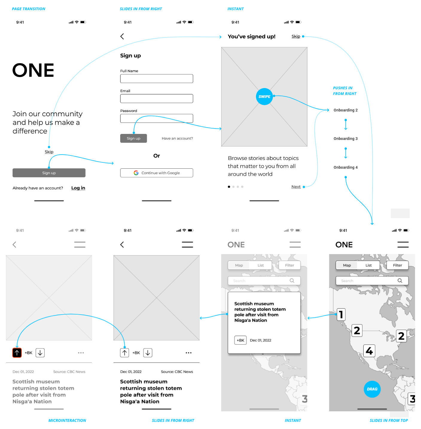
Wireframes
Building upon my user flow and insights from user research, I developed a wireflow to design the interactions and usability of the app. The wireflow helped me visualize the app's structure and identify potential issues.
Minimalist approach
Informed by my competitor analysis, I adopted a minimalist and simple design philosophy, reducing visual clutter and focusing on essential elements.
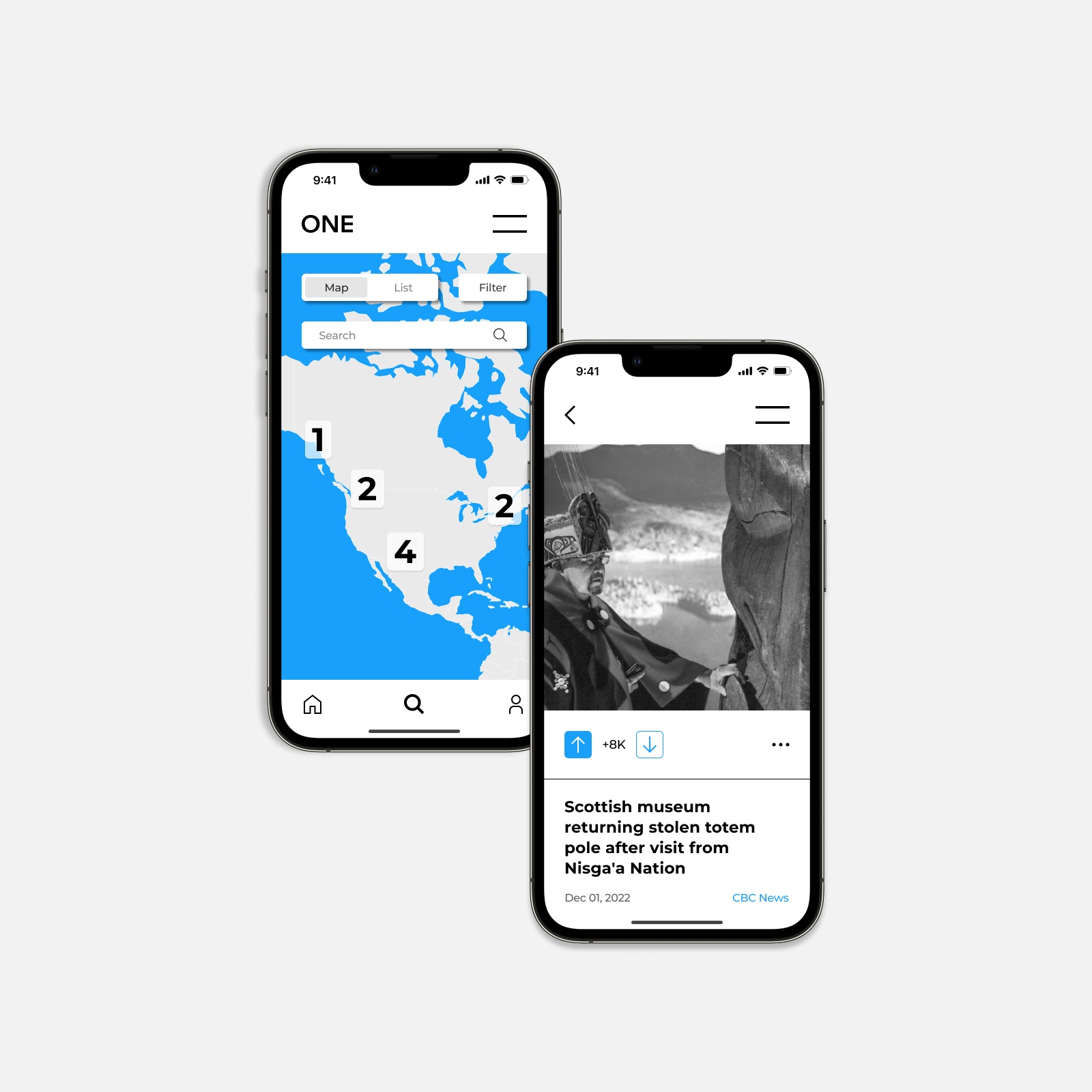
Map with article indicators
The Browse page features an interactive map with numbered markers, which indicate the number of articles available to read related to a specific area.
Layered page transitions
I implemented layered page transitions throughout the app to help users navigate between pages seamlessly.
Voting microinteraction
To make voting engaging, I created prominent call-to-action buttons for up-voting and down-voting with a subtle microinteraction
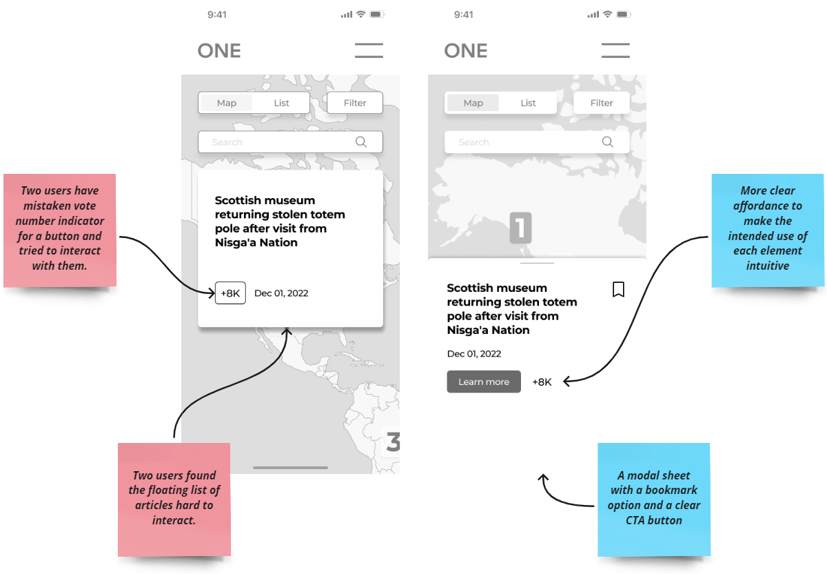
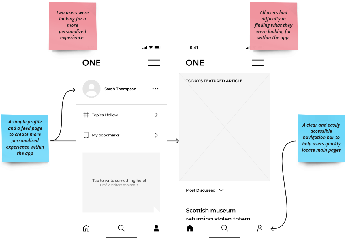
Usability Test
To validate my design decisions, I conducted usability tests using the low-fidelity prototype. I gathered valuable feedback from participants which allowed me to identify areas for improvement in my design.
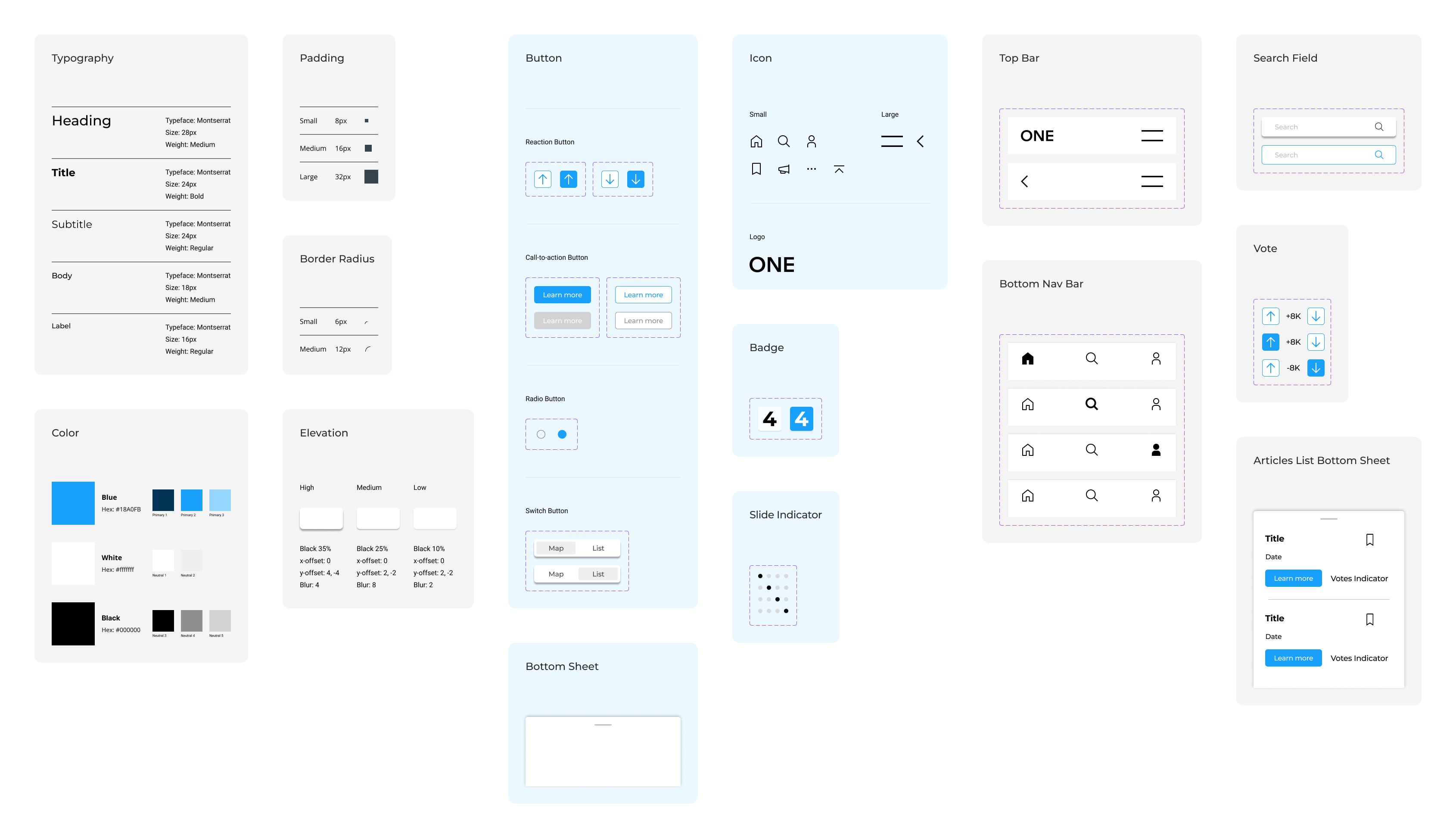
Design Library
I developed a simple design library in Figma to ensure consistency and efficiency throughout the project. The library consists of three categories; A foundation (e.g., colour palette and typography), simple components (e.g., icons and buttons), and complex components (e.g., navigation bar and modals). Using editable components made the iterations quicker.
Next Step
For the next step, I will conduct usability testing with a high-fidelity prototype to validate my design decisions and identify any further areas for improvement.